
Top Graphic Design Trends for Better Marketing Visuals
Graphic design trends are not just about what looks cool this month.
They shape how people notice, understand, trust, and remember your brand.
That matters because visual communication is everywhere now. Your audience may see your brand through a LinkedIn post, Instagram carousel, YouTube thumbnail, images, landing page, email header, ad creative, product screenshot, pitch deck, or AI-generated campaign image before they ever read a full paragraph of your copy.
And yes, design is changing fast.
AI tools make it easier to create visuals. 3D and motion make digital content feel more immersive. Bold typography helps brands stand out in crowded feeds. Minimalism keeps complex messages easier to understand. Accessibility pushes teams to design for more people, not just for people with perfect screens, perfect eyesight, and perfect patience.
But the real question is not “Which graphic design trend should we copy?”
The better question is:
Which visual choices help our audience understand our message faster and trust our brand more?
In this guide, we’ll look at the top graphic design trends shaping the future of visual communication and how marketers, creators, and content teams can use them without turning every design into a trend salad.
Chapters
Design Trend Navigator
Visual Style Finder
What's your vibe?
Select your industry or style to find the perfect trend.
--
--
Color The Future
Trending color schemes for 2025.
Generate Assets
Create prompts for Midjourney/DALL-E.
How Marketers Should Use Graphic Design Trends
Graphic design trends are useful when they help you communicate better.
They become a problem when they are used only because they are popular.
A trend should support the message, audience, and channel. A bold experimental typeface may work beautifully for a music festival poster. The same typeface on a financial services landing page may make people quietly close the tab and rethink their life choices.
Before using a design trend, ask:
- Does this visual style fit our brand?
- Does it make the message clearer?
- Does it help the audience understand the offer?
- Does it work on mobile?
- Does it still look good when cropped for social media?
- Does it support accessibility and readability?
- Can we use it consistently across campaigns?
- Will it still make sense when the trend cools down?
The goal is not to look trendy.
The goal is to look relevant, clear, and memorable.
Graphic Design Trends and Where They Fit Best
Not every design trend belongs on every channel.
Use this table to match visual trends with practical marketing use cases:
| Design trend | Best marketing use | Why it works | What to avoid |
|---|---|---|---|
| AI-assisted visuals | Campaign concepts, social visuals, mood boards, ad variations, blog graphics | Helps teams create more visual directions faster. | Publishing generic AI visuals without brand editing or human review. |
| 3D and depth | Product visuals, hero images, app graphics, ecommerce, SaaS illustrations | Makes digital products and abstract ideas feel more tangible. | Adding 3D only for decoration when it slows the page or distracts from the message. |
| Motion design | Short videos, ads, product demos, landing pages, social content | Guides attention and helps explain change, flow, or product movement. | Using animation that feels flashy but does not help the viewer understand anything. |
| Bold typography | Social hooks, posters, thumbnails, campaign headlines, hero sections | Creates visual impact and makes the core message harder to miss. | Choosing fonts that look interesting but are hard to read. |
| Minimalist layouts | Landing pages, dashboards, pitch decks, product pages, email design | Reduces noise and makes the next action clearer. | Removing so much personality that the brand feels empty. |
| Data visualization | Reports, case studies, thought leadership, B2B content, performance updates | Turns numbers into faster understanding. | Making charts beautiful but confusing. |
| Accessible design | Websites, apps, social graphics, PDFs, presentations, email campaigns | Makes visuals easier to understand for more people. | Using color alone to communicate meaning or ignoring contrast. |
Pick the right trend based on your goal
| Your goal | Use these trends | Why it works | Best place to apply |
|---|---|---|---|
| More attention (scroll-stopping) | Bold typography, vibrant palettes, motion | Creates strong hierarchy and pattern breaks | Social posts, ads, hero sections |
| More clarity (faster comprehension) | Minimalism + strong hierarchy, data visualization | Reduces cognitive load and improves scanning | Landing pages, product pages, reports |
| More “premium” feel | Realistic textures, 3D depth, refined typography | Adds craft and perceived quality | Packaging, websites, pitch decks |
| More engagement | Interactivity, micro-animations, AR elements | Turns viewers into participants | Web experiences, campaigns |
Trend-by-trend “use it / avoid it” cheat sheet
| Trend | Best for | Avoid when | Quick implementation tip |
|---|---|---|---|
| 3D depth & realism | Product storytelling, premium branding | It slows performance or distracts from CTA | Use 3D as a focal accent, not everywhere |
| Motion & interactivity | Guiding attention and explaining changes | Motion causes distraction or accessibility issues | Use motion to clarify transitions (not decoration) |
| Minimalism & abstract | Clarity and modern brand systems | Brand needs warmth/humanity but looks “cold” | Add warmth via illustration, texture, or photography |
| Experimental typography | Brand identity and headline impact | Body copy readability suffers | Keep body fonts simple; experiment in headlines |
AI Art
Here’s a quick explainer video of how to use AI to create breathtaking visuals:
AI has changed not only the way people create written content, but also visual content.
With a prompt and a click of a button, you can create stunning graphic designs in seconds. You might want to tweak some elements, or just use it for inspiration, but the fact is that AI Text-to-image Generators are becoming more powerful by the day and you need to not only keep an eye out for the trend but also start using AI and see how it can help you. Check out the best AI Text-to-Image Generators and stat for free.
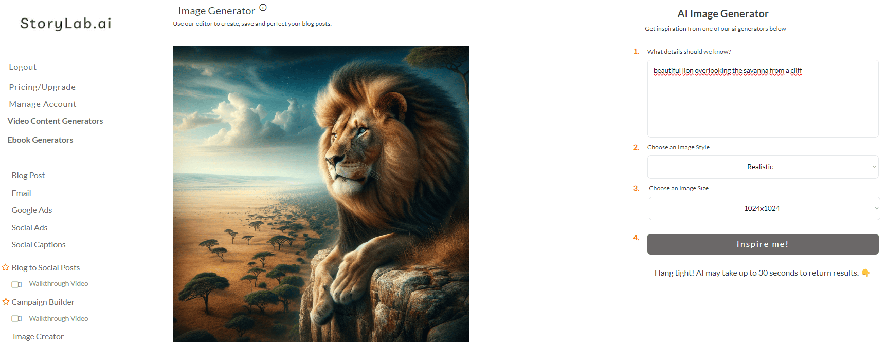
Here is what it looks like when using StoryLab.ai’s Text to Image Generator:
3D Depth and Realism
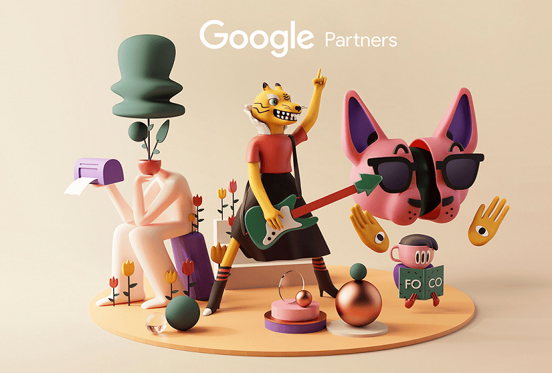
Second on the list of the graphic design trends of the future is 3d models.
Advancements in technology have allowed for the creation of more realistic and immersive 3D designs, which are predicted to become even more prevalent in the upcoming years.
With the use of depth mapping, designers can craft visuals that feel almost tangible. This involves measuring the distance between objects and their environment to generate a true sense of dimension and realism. Techniques like stereo vision, time-of-flight sensors, and structured light scanning help produce lifelike results.
These innovations have a wide range of applications, with virtual staging being a prime example. By applying 3D modeling to real estate photography, virtual staging allows for highly realistic representations of furnished spaces without the need for physical setup. It’s a powerful tool for marketers, realtors, and designers looking to create immersive, cost-effective visual experiences.
The information can then be used to create 3D models or images that accurately depict how they would appear in real life. There are several methods used for depth mapping, including stereo vision, time-of-flight sensors, and structured light scanning.
Here’s how to use 3D depth and realism in your visuals:
- Create Immersive Experiences. This technique allows for the creation of immersive experiences in virtual reality and augmented reality applications. It is transforming the way we interact with digital content and adds a new dimension to the user experience.
- Accurate Product Visualization. For product designers, it can be used to create accurate and detailed 3D models of products. This allows for better visualization during the design process and helps with prototyping.
- Architectural Design. In architecture, it is used to create realistic representations of buildings and structures. It helps clients visualize the final product and make any necessary changes before construction begins.
Augmented Reality (AR) Integration
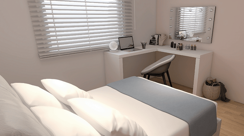
With the rise of augmented reality in recent years, this technology is predicted to become even more integrated into graphic design in the future.
AR allows for the overlay of digital content onto the real world, creating an interactive and immersive experience. With the use of AR in graphic design, static images can come to life and engage with the viewer.
So, how to implement augmented reality integration in graphic design?
Here are three ways:
- Interactive Advertising. AR can be used in advertising campaigns to create interactive experiences for consumers. It allows a more engaging and memorable advertisement.
- Enhance User Experience. In web design, it can be used to enhance the user experience by providing interactive elements and additional information.
- Product Visualization. Similar to 3D depth and realism, AR can also be used for product visualization, allowing customers to see how a product would look in their own space before making a purchase.
Neomorphism
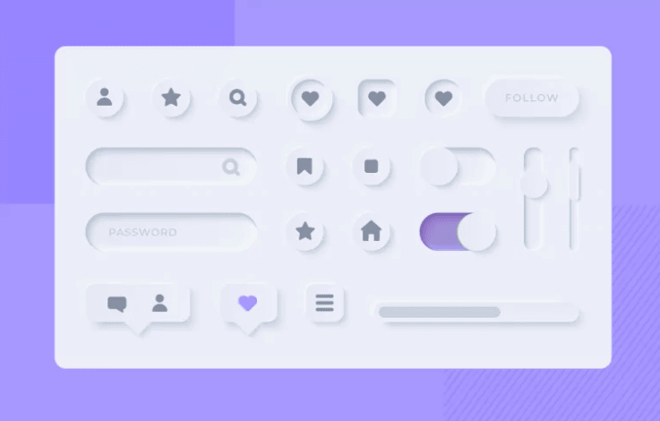
Neomorphism is a trend that combines elements of flat design and skeuomorphism.
It involves creating designs with soft shadows and highlights, giving them a realistic and three-dimensional appearance.
This trend is predicted to become more popular in the future as it creates a modern and sleek visual aesthetic.
Do you want to know how to incorporate neomorphism in your visuals?
Here are three options:
- User Interface Design. It can be used in custom web application development like user interface (UI) design to create a more intuitive and visually appealing experience.
- Product Packaging. This trend also works well for product packaging, as it creates an eye-catching and modern look.
- Web Design. It can also be incorporated into web design to add depth and visual interest to a website.
Bold Fonts and Experimental Typography

Typography is an essential element of graphic design, but it is often overlooked. In the future, we can expect to see more experimental and bold typography being used in designs.
Freelancers are pushing the boundaries and creating unique typefaces that add personality and character to a design. This trend is also driven by advancements in technology, allowing for more creative freedom when it comes to typography.
Here are three key points you may want to analyze:
- Brand Identity. It can help create a strong brand identity, making your designs stand out from the competition.
- Visual Hierarchy. Using different font weights and sizes can help create a visual hierarchy in your design, drawing attention to important elements.
- Emphasize Key Messages. Experimenting with typography can also help emphasize key messages and make them more memorable for the viewer.
Illustrations with Realistic Textures
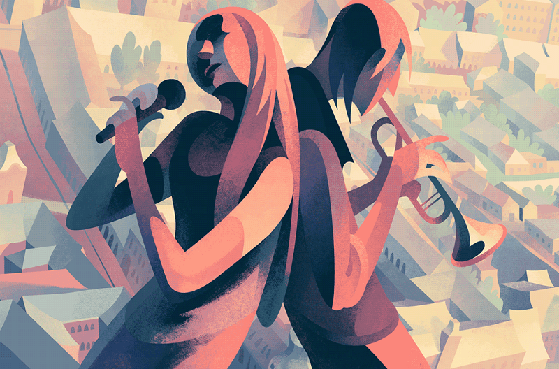
Incorporating realistic textures into illustrations can add a new dimension to graphic design visuals.
This trend involves using images of real-life textures, such as wood, fabric, or concrete, and incorporating them into illustrations or designs. It creates a tactile and lifelike visual that can be appealing to the viewer.
Here’s how to use realistic textures in your designs:
- Enhance Visual Appeal. Adding textures to illustrations can make them more visually appealing and add depth to the design.
- Create Contrast. Combining different textures with flat elements can create contrast and make certain elements stand out.
- Add Realism. Textures can also add a sense of realism to illustrations, making them more relatable for the viewer.
Motion and Interactivity
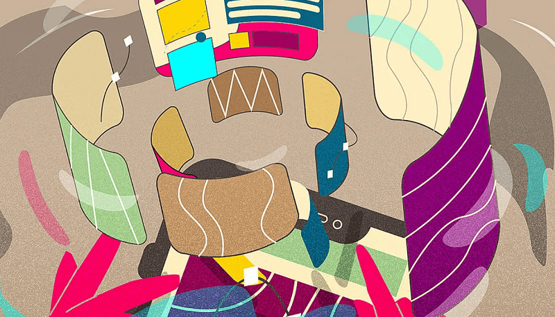
As technology continues to advance, the use of motion and interactivity in graphic design is becoming more prevalent.
This trend involves incorporating animation or interactive elements into designs to create a dynamic and engaging experience.
So, how to incorporate it into your graphics?
Here’s how:
- Storytelling. Animation and interactivity can be used with storytelling in business presentations, and to convey a message in a more engaging way.
- Website Design. Adding motion and interactive elements to websites can make them more visually interesting and keep visitors engaged.
- Social Media Marketing. Animated or interactive posts on social media can help brands stand out and capture the attention of their audience.
Minimalistic and Abstract
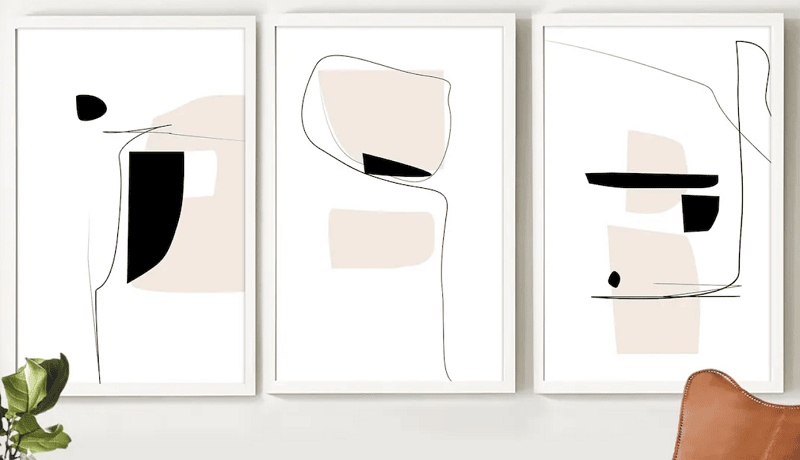
With the constant influx of information and stimuli, minimalist and abstract designs are becoming a popular trend in graphic design.
It strongly focuses on simplicity and using minimal elements to convey a message or idea.
Here’s how to use minimalism and abstraction in your visual creations:
- Simplicity. This type of design can help simplify complex ideas or messages, making them easier for the audience to understand.
- Visual Impact. By using minimal elements, you can build a strong visual impact that captures the viewer’s attention.
- Versatility. Minimalist and abstract designs can be used in various mediums, including print and digital, making them versatile for different design projects.
90s Space Psychedelia

Inspired by the 90s psychedelic art movement, this trend is characterized by bold and vibrant colors, retro fonts, and trippy visuals. It creates a sense of nostalgia while also feeling futuristic.
So, how to incorporate this trend into your designs?
Here’s how:
- Retro Design. Use retro fonts, bright colors, and abstract patterns to create a 90s-inspired design.
- Event Posters. This trend works well for event posters or flyers, as it can attract attention and create a unique visual that stands out from the crowd.
- Music Album Covers. The 90s space psychedelia trend can also be used for music album covers to create a unique and eye-catching visual that represents the artist’s style.
Candy Pastels
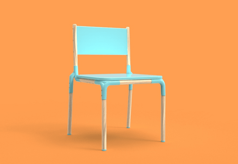
This trend involves the use of soft and sweet pastel colors, creating a whimsical and dreamy aesthetic.
These particular color palettes can evoke feelings of nostalgia and create a sense of comfort for viewers.
To incorporate candy pastels in your visuals, follow these considerations:
- Children’s Designs. This trend works well for children’s designs, as the soft colors and dreamy aesthetic can appeal to young audiences.
- Feminine Designs. Candy pastels are also commonly used in feminine designs, bringing a soft and delicate touch to the visuals.
- Product Packaging. Incorporating this into product packaging can give off a playful and fun vibe, making it stand out on shelves.
Retro and Vintage Aesthetics
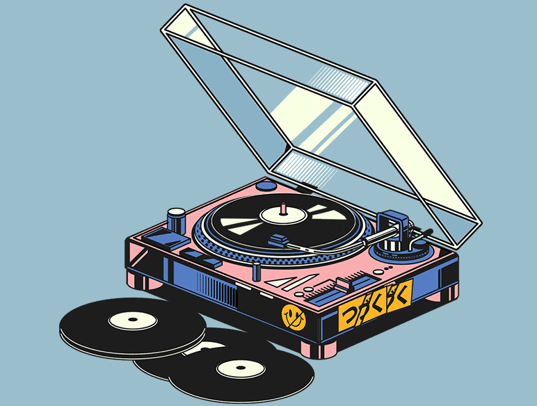
With a rise in nostalgia and vintage-inspired trends, retro and vintage aesthetics are becoming popular in the world of graphic design.
This trend involves using elements from past eras, such as retro fonts, color schemes, and illustrations.
Here’s how to use retro and vintage aesthetics in your designs:
- Brand Identity. This trend can be used to create a unique brand identity that stands out from modern designs.
- Throwback Designs. Retro and vintage aesthetics can also be incorporated into throwback designs, such as event posters or product packaging for a nostalgic touch.
- Mixing Eras. Combining elements from different past eras can create a unique and visually interesting design that captures the essence of retro and vintage aesthetics.
How to apply trends without breaking your brand
| Brand element | What to lock | What can evolve with trends | Rule of thumb |
|---|---|---|---|
| Typography | Body typeface and readability rules | Headline styles, variable font axes | Experiment in headlines, protect body readability |
| Color | Core palette + contrast standards | Seasonal accents, gradients, duotones | Use accents for campaigns, not the whole system |
| Layout | Grid and spacing system | Hero treatments, illustration styles | Keep structure consistent, swap visuals |
| Imagery | Subject guidelines and tone | Textures, 3D elements, retro styling | Same story, new outfit |
Accessibility and inclusivity checklist for trendy design
If you use bold colors, motion, or fancy UI styles, accessibility becomes a key differentiator. Many of the best AI UI design tools now include accessibility checks, color contrast analysis, and responsive design features to help create interfaces that are both visually appealing and inclusive.
- For text contrast, WCAG guidance explains the intent and thresholds (contrast minimum).
- For non-text UI elements (icons, form fields), non-text contrast is also defined.
| Check | What to verify | Why it matters | Fast fix |
|---|---|---|---|
| Text contrast | Body text meets WCAG contrast guidance | Improves readability for many users | Increase contrast or font weight |
| Non-text contrast | Buttons, icons, input borders are visible | People must see controls to use them | Strengthen UI outlines and icon contrast |
| Motion sensitivity | Motion supports meaning and isn’t overwhelming | Reduces distraction and discomfort | Use motion sparingly and keep it purposeful |
| Legibility | Experimental type is still readable at small sizes | Style should not block comprehension | Reserve experimental type for large headings |
Trends meet tech” (variable fonts, performance, and motion)
Variable fonts are supported via CSS properties like font-variation-settings (and related guidance).
| Design trend | Tech enabler | Benefit | Watch out for |
|---|---|---|---|
| Responsive typography | Variable fonts | Flexible weight/width for better hierarchy | Overusing axes can hurt consistency |
| Motion design | Micro-animations | Guides focus, clarifies state changes | Too much motion reduces usability |
| 3D visuals | Optimized assets | Premium look without heavy load | Large files slow pages and hurt UX |
A simple “trend testing” workflow (so you don’t just copy aesthetics)
| Step | What you do | What to measure | Pass criteria |
|---|---|---|---|
| 1) Pick one surface | Choose a single page/ad format | Baseline metrics | Clear baseline exists |
| 2) Change one thing | Swap typography OR palette OR motion | CTR, scroll depth, time on page | No drop in usability signals |
| 3) Add guardrails | Check contrast, legibility, load time | Accessibility + performance | Meets standards |
| 4) Roll out selectively | Apply to the campaign or section | Conversion rate | Improves or holds steady |
AI Is Changing Graphic Design, But Strategy Still Matters
AI design tools are changing how teams brainstorm, create, and test visuals.
That is exciting.
It is also dangerous if teams use AI like a vending machine for random images.
AI can help with:
- Mood board ideas
- Visual concept directions
- Campaign image variations
- Product mockups
- Social media visuals
- Ad creative testing
- Backgrounds and textures
- Layout inspiration
- Thumbnail concepts
- Brand style exploration
But AI does not automatically understand your brand strategy, customer trust issues, conversion goals, legal risks, accessibility needs, or whether that shiny visual actually supports the message.
Use AI to speed up exploration.
Then use human judgment to choose what belongs to the brand.
A good AI-assisted design workflow looks like this:
| Step | What to do | Why it matters |
|---|---|---|
| Start with the message | Define what the visual needs to communicate. | Prevents pretty but pointless design. |
| Create several directions | Use AI to explore styles, layouts, colors, and visual metaphors. | Expands creative options quickly. |
| Filter through brand rules | Check tone, colors, typography, audience fit, and trust signals. | Keeps visuals consistent with the brand. |
| Edit for clarity | Simplify the layout, improve hierarchy, and remove distractions. | Makes the visual easier to understand. |
| Check accessibility | Review contrast, text size, color dependence, and readability. | Helps more people use and understand the design. |
| Test in context | Preview the design on the platform where it will appear. | A design that works in a large mockup may fail in a tiny feed preview. |
AI can help you create faster.
It should not make you think less.
Visual Communication Is Becoming More System-Based
Modern brands do not need one nice-looking image.
They need a visual system.
That means your social posts, blog graphics, ads, landing pages, videos, presentations, product visuals, and email designs should feel connected.
A strong visual system includes:
- Color palette
- Typography rules
- Image style
- Icon style
- Layout principles
- Button and CTA treatment
- Chart and data visualization rules
- Social media templates
- Video thumbnail style
- AI prompt guidelines for brand visuals
This matters more as AI-generated visuals become easier to produce. Without a system, your brand can quickly look like twelve different companies having an argument in the same folder.
A visual system gives AI tools and human designers the same direction.
That is how you scale design without losing consistency.
Accessibility Is Not Optional in Future Visual Communication
A design trend is not successful if people cannot read it, understand it, or use it.
Future-ready design needs to consider accessibility from the start.
That means:
- Use strong text contrast.
- Do not rely on color alone to communicate meaning.
- Keep typography readable.
- Avoid tiny text in social graphics.
- Add captions to videos.
- Use clear hierarchy.
- Make charts understandable.
- Test visuals on mobile.
- Check how designs look in light and dark environments.
- Avoid overly busy layouts that make the message harder to process.
This is especially important for marketers.
A campaign visual can look beautiful and still fail if the headline is unreadable, the CTA is hidden, or the color contrast is weak.
Accessibility is not only a compliance issue.
It is a communication issue.
How to Choose Which Graphic Design Trends to Use
Use this decision table before adding a trend to your brand or campaign:
| Question | Good sign | Warning sign |
|---|---|---|
| Does it fit the brand? | The trend supports your tone, positioning, and audience expectations. | It looks cool but feels disconnected from your brand. |
| Does it improve clarity? | The message becomes easier to notice or understand. | The design becomes harder to read or more confusing. |
| Can it scale? | You can use it across ads, social, blog visuals, emails, and decks. | It only works in one fancy example. |
| Is it accessible? | Text, contrast, color, and layout are easy to process. | The trend depends on low contrast, tiny text, or color-only meaning. |
| Does it support conversion? | The CTA, offer, or key message becomes more visible. | The design gets attention but distracts from the next step. |
| Will it age well? | The trend can be adapted into your brand system. | It feels like a short-lived visual gimmick. |
The best brands do not chase every trend.
They translate the right trends into their own visual language.
Graphic Design Checklist for Marketing Teams
Before publishing a design, check:
| Checklist item | Question to ask |
|---|---|
| Message | Can someone understand the main idea quickly? |
| Hierarchy | Does the most important element stand out first? |
| Brand fit | Does this look and feel like your brand? |
| Readability | Can people read the text on mobile? |
| Accessibility | Is there enough contrast and no color-only meaning? |
| Platform fit | Does the design work in the actual feed, ad placement, email, or page layout? |
| CTA clarity | Is the next step easy to notice? |
| Visual focus | Is anything competing with the main message? |
| Consistency | Does it match the rest of the campaign? |
| Human review | Has someone checked the AI-generated or template-based output before publishing? |
Takeaways
Graphic design trends can give your brand fresh energy.
AI visuals can speed up creativity.
3D can make ideas feel tangible.
Motion can guide attention.
Typography can create personality.
Minimalism can make complex messages easier to understand.
Accessibility can make your communication stronger for more people.
But none of that matters if the message gets lost.
The future of visual communication is not just more effects, more tools, or more styles.
It is clearer, faster, more human communication.
Use trends to support that.
From implementing realistic textures to creating interactive experiences, these trends offer opportunities to create visually captivating designs that connect with audiences in a new way.
So don’t be afraid to experiment and use new concepts in your designs, but also make sure to add your own unique touch and style to make them truly stand out.
Keep exploring, learning, and pushing the boundaries of visual communication as we enter the future of design.
Remember, the possibilities are endless when it comes to creating visually stunning and engaging images.
About the Author
Erik Emanuelli has been in the online marketing game since 2010. He’s now sharing what he has learned about SEO and blogging on his website.
FAQ
What are graphic design trends?
Graphic design trends are recurring visual styles, techniques, and communication patterns that become more common across branding, advertising, digital design, social media, packaging, and web design. Trends can include typography, color, layout, motion, illustration, AI-generated visuals, 3D elements, minimalism, texture, and accessibility-focused design.
Why do graphic design trends matter for marketers?
Graphic design trends matter because visuals shape how quickly people notice, understand, and remember a message. Canva’s visual communication research reports that teams use visual communication to improve clarity, speed, and business results, which is why design has become a key part of modern marketing and workplace communication.
Is AI one of the biggest graphic design trends?
Yes. AI-assisted design is one of the biggest shifts in graphic design because it helps teams generate concepts, explore styles, create variations, and speed up production. Adobe’s Creative Trends report highlights how emerging aesthetics and creative technology are shaping visual culture, while research on AI image tools in graphic design shows that designers use AI as a creative partner for ideation and collaboration.
Will AI replace graphic designers?
AI may change the design workflow, but it does not replace the need for human strategy, taste, context, judgment, and brand understanding. AI can create visual options quickly, but humans still decide what fits the audience, message, ethics, accessibility, and business goal. Recent design research also frames AI as a tool that can enhance human creativity rather than fully replace it.
How can brands use AI-generated visuals safely?
Brands should use AI-generated visuals as a starting point, not a final answer. Check every visual for brand fit, originality, legal risk, accuracy, accessibility, and whether it supports the campaign message. Teams should also create internal AI design guidelines so visuals stay consistent across ads, social posts, landing pages, email, and content marketing.
Why is accessibility important in graphic design?
Accessibility helps more people understand and use visual communication. Digital.gov advises visual designers not to use color alone to convey meaning and to reinforce information with icons, written content, and other visual elements. This is especially important for charts, buttons, warnings, forms, and social media graphics.
What contrast should designers use for text?
WCAG guidance says normal text should generally have a contrast ratio of at least 4.5:1, while large text should generally have a contrast ratio of at least 3:1. Strong contrast improves readability for people with low vision and for anyone viewing content on small screens or in difficult lighting conditions.
Is minimalism still a useful design trend?
Yes. Minimalism remains useful when it improves clarity, reduces distraction, and helps users focus on the message or next action. Canva’s design trend research highlights a move toward cleaner layouts, simple branding, and more restrained visual systems as part of a broader response to visual overload.
How should brands use bold typography?
Bold typography works well for campaign headlines, social hooks, posters, thumbnails, landing page hero sections, and brand statements. The key is readability. A font can be expressive without becoming hard to understand. If users need to work too hard to read the message, the design is getting in the way.
Why is motion design important in visual communication?
Motion design can guide attention, explain product flows, show transitions, and make digital communication feel more engaging. It is especially useful for short videos, product demos, ads, onboarding, and social media content. Motion should have a purpose, such as directing attention, clarifying a process, or adding emotional energy.
How can marketers choose which design trends to follow?
Marketers should choose trends based on brand fit, audience needs, clarity, accessibility, campaign goals, and channel fit. A trend is worth using when it makes the message easier to notice, understand, remember, or act on. A trend is not worth using when it makes the design harder to read or disconnected from the brand.
Are 3D visuals useful for marketing?
Yes, 3D visuals can help make digital products, physical products, abstract concepts, and product benefits feel more tangible. They work well for hero images, ecommerce visuals, product explainers, app graphics, and brand campaigns. But 3D should support the message. If it only adds visual noise, it may weaken the design.
What is the difference between graphic design and visual communication?
Graphic design focuses on creating visual assets through typography, color, layout, imagery, and composition. Visual communication is the broader goal: using visuals to communicate ideas, messages, instructions, emotions, or information clearly. Strong graphic design should serve visual communication, not just decoration.
How can AI help marketers create better design briefs?
AI can help marketers turn campaign goals, audience insights, brand guidelines, and content ideas into clearer design briefs. A good brief should explain the audience, message, channel, tone, CTA, required assets, brand rules, and accessibility needs. Better briefs lead to better visuals, whether a human designer, AI tool, or both are involved.
What is the biggest mistake brands make with design trends?
The biggest mistake is copying trends without a strategy. A design can look modern and still fail if the message is unclear, the CTA is hidden, the colors reduce readability, or the style does not fit the brand. Trends should serve the message, not replace it.
What are the top graphic design trends currently?
Trends include minimalism, bold typography, and vibrant colors.
How is sustainability influencing graphic design trends?
Eco-friendly designs and green branding are becoming popular.
Are retro styles coming back in graphic design?
Yes, vintage and retro aesthetics are resurfacing.
What role is technology playing in current graphic design trends?
AR, VR, and 3D design are increasingly influential.
How are typography trends evolving in graphic design?
Experimental and oversized typography is trending.
Is there a shift towards more minimalistic designs?
Yes, minimalism with a focus on simplicity and function is in vogue.
Are any color schemes dominating recent graphic design trends?
Bold and vibrant color palettes are gaining popularity.
How are graphic designs incorporating motion and animation?
Motion graphics and micro-animations are becoming more prevalent.
What is the trend in logo design in the current market?
Simplified logos with a focus on scalability and versatility are trending.
How is the digital landscape influencing graphic design trends?
Digital-first designs, optimized for screens and online media, are key.
What is the role of texture in current graphic design trends?
Textured interfaces and backgrounds are adding depth to designs.
How are geometric shapes being used in modern graphic design?
Geometric patterns and abstract shapes are trending.
Is there a trend towards more organic design elements?
Yes, organic, fluid shapes and natural elements are popular.
How is illustration evolving in graphic design trends?
Hand-drawn and unique custom illustrations are gaining traction.
Are gradients still a popular trend in graphic design?
Gradients, especially vibrant and dynamic ones, remain popular.
How is personalization reflected in current graphic design trends?
Designs are increasingly tailored for niche audiences and personalized experiences.
What is the impact of social media on graphic design trends?
Designs optimized for social media engagement, like memes and infographics, are trending.
Is there a rise in the use of monochrome in graphic design?
Yes, monochrome and duotone designs are making a comeback.
How are designers incorporating inclusivity in their work?
Designs reflecting diverse cultures and inclusivity are becoming more prevalent.
What is the trend in using negative space in graphic designs?
Clever use of negative space to convey dual meanings is trending.
What is the significance of data visualization in current graphic design?
Data visualization is key, with infographics and interactive charts trending.
How is augmented reality (AR) impacting graphic design trends?
AR is leading to more immersive and interactive designs.
Are there any trends in typography for web design?
Responsive and variable typography for web interfaces is gaining popularity.
What trends are emerging in packaging design?
Eco-friendly packaging and bold, illustrative designs are in vogue.
How is animation being used in modern web design?
Subtle animations for user interactions are trending in web design.
What is the trend in digital illustration in graphic design?
A blend of 3D and flat design elements is becoming popular.
How are graphic designers approaching mobile-first design?
Prioritizing mobile functionality with clean, responsive layouts is key.
What trends are there in the use of color in graphic design?
Muted color palettes with occasional bold accents are trending.
Is there a trend towards more authentic imagery in design?
Authentic, relatable imagery over stock photos is gaining ground.
How are design trends adapting to virtual and remote environments?
Designs are focusing on clarity and ease of use for remote interactions.
Master the Art of Video Marketing
AI-Powered Tools to Ideate, Optimize, and Amplify!
- Spark Creativity: Unleash the most effective video ideas, scripts, and engaging hooks with our AI Generators.
- Optimize Instantly: Elevate your YouTube presence by optimizing video Titles, Descriptions, and Tags in seconds.
- Amplify Your Reach: Effortlessly craft social media, email, and ad copy to maximize your video’s impact.